Contact Block
This page provides content entry reference information for the Contact block.
What this component does:
The Contact block holds a block of contact information that can be pulled into the left sidebar of pages, below the navigation links.
The block can hold one or two sets of contact information.
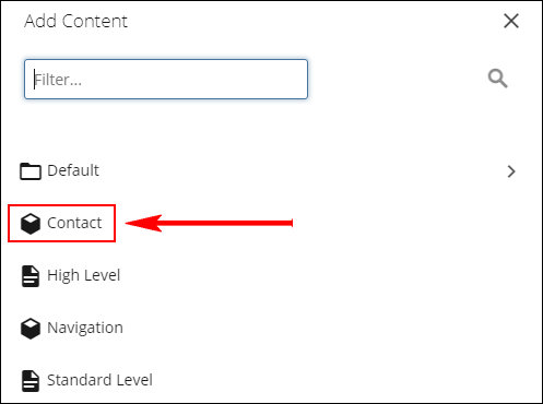
Asset factory used to create the Contact block:
The Contact asset factory is used to create a Contact block.

Component content entry fields:
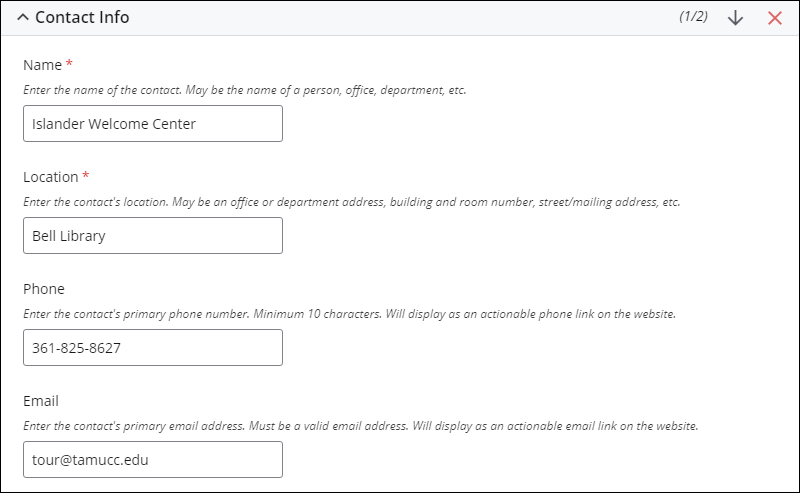
The Contact field for entering the contact information manually.

The block supports up to two sets of Contact Info content.

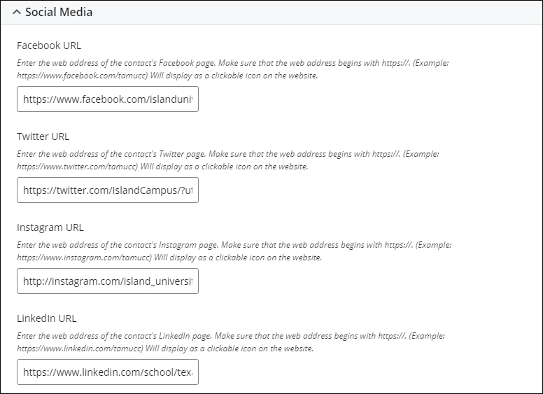
Each Contact Info content includes a set of Social Media fields. The full web addresses (URLs) of the contact's social media channels are entered into the fields. The links are displayed as clickable icons.

Block display on the page:
The Contact information is displayed in the left sidebar of the page, below the navigation links.
Changing the order of the Contact information in the block:
Use the Up and Down arrows to change the ordering of the sets of Contact information. The top-to-bottom ordering of the sets in edit mode translates directly to the top-to-bottom ordering when pulled in and displayed on a page.

Preview display of the Contact block
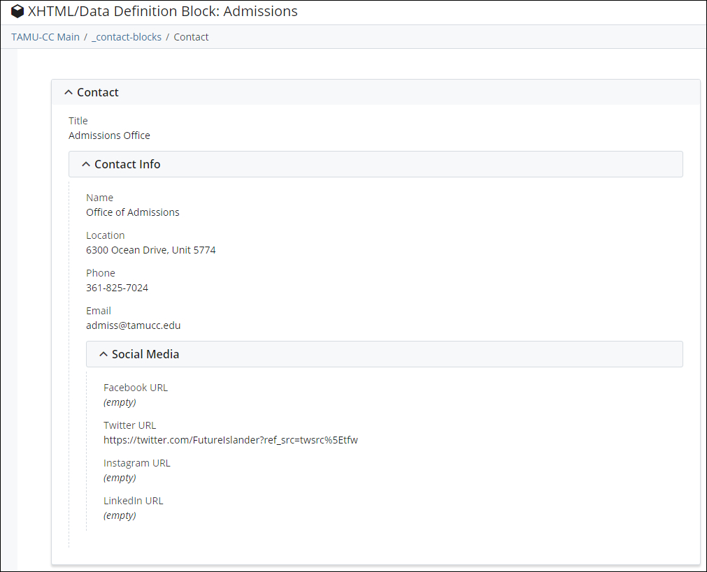
Since Contact block does not have a template or styling attached directly to it, there is not a method to preview how it content will display on the website. The content is formatted and styled byt the website's styles when it is pulled in a page. The "Preview" display of the block is used to check the accuracy and spelling of the information in the block. Ensure the phone number adheres the campus design guide, for example, 361.825.5555.

Example of how this block displays on the page:
In the left sidebar of this page is an example of how the Contact component displays.