Standard Level Page
This page provides content reference information for the components on the Standard Level page.
What the Standard Level Page is used for:
The Standard Level Page is used for general content pages on the TAMU-CC Main site and other sites (and can be used as the main page for sections within these sites, as well).
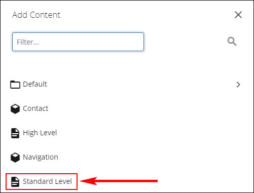
Asset factory used to create a Standard Level page:
The Standard Level asset factory is used to create a new page using the Standard Level template.
Fixed Content Entry Fields

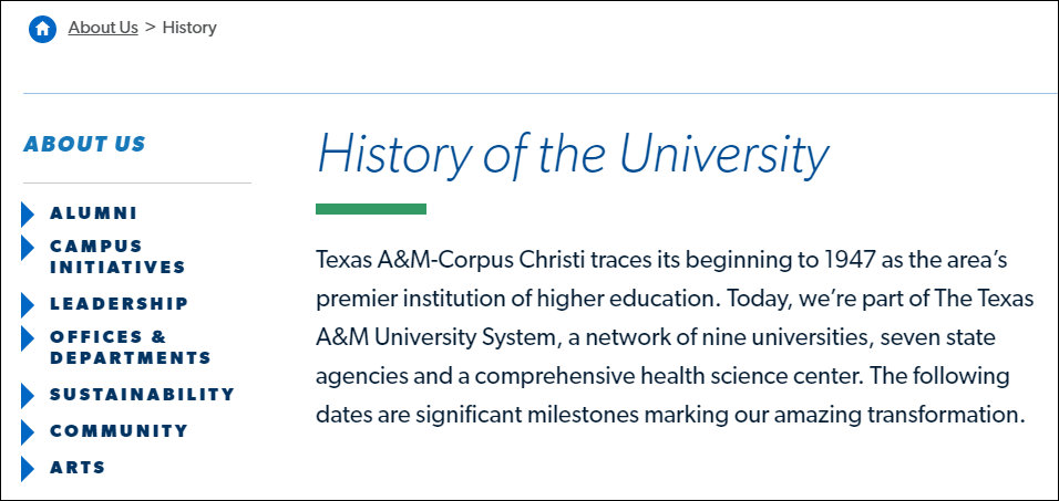
The Title field is used for:
- Main heading (H1) for the page (displayed at the top of the page)
- Title of the page in browser tab
- Title for the page in search results (on the TAMUCC site and external such as Bing and Google)
- Breadcrumb trail navigation

The Page Title field overrides the Title field as the main heading (H1) at the top of the page.
The content of the Page Title field is displayed only as the main heading at the top of the page. The content of this field is not displayed in any other place and does not override the content of any field other than the Title field.
Metadata and Navigation Settings
The Description meta data field and the field for including the page in or excluding the page from the dynamic sidebar navigation are on the Metadata screen.
Click the Metadata tab at the top of the page editing screen to access the Metadata screen.


This field holds a brief description/overview of the page's content.
The content of this field is not visible on the pag. It is used to create a META tag in the page's source code. This tag includes the content entered into the Description field.
The META tag is used to provide a description for the page when it appears in the TAMUCC website search and when it appears in external search engins such as Bing and Google.
The Show In Navigation field is used to to include the page in or to exclude the page from the dynamic navigation in the left sidebar.
When the Yes check box is checked, the page is included in the dynamic navigation in the left sidebar.
When the Yes check box is unchecked, the page is excluded from the dynamic navigation in the left sidebar.

Main Body Components
This section provides content reference information for the Masthead component.
What this component does:
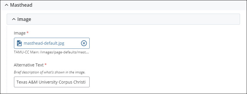
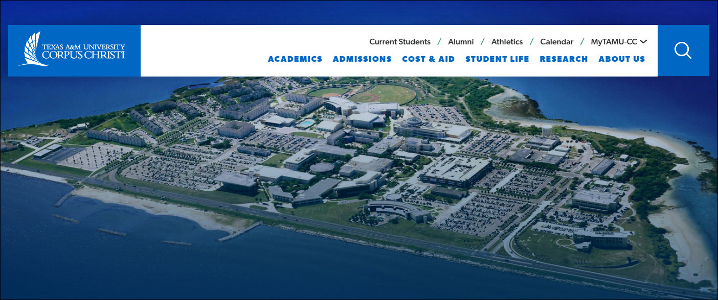
The Masthead component holds the image displayed at the top of the page.
Component content entry fields
Image dimensions: 2000 pixels wide by 850 pixels high (2000 x 850)
Example of how this component displays on the page:
This section provides content reference information for the WYSIWYG component.
What this component does:
The WYSIWYG component is used to hold the main content of the page. This component provides the most options for content formatting and supports breaking the content into sections using headings and supports links.
Component content entry fields:
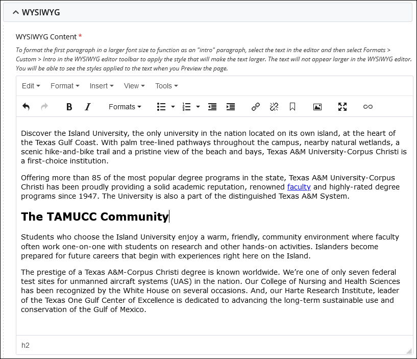
Formatting the first paragraph of content as an "Intro" paragraph:
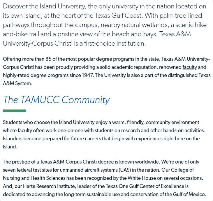
The WYSIWYG component supports formatting a paragraph of content as "Intro" content. This formatting displays the text at a larger size and different style than regular text content. This enables the text to act as
Example of how this component displays on the page:
Below is an example of how the WYSIWYG component displays on the website. This example includes the first paragraph formatted as an "Intro" paragraph.
Using images in WYSIWYG editor content
Follow the below procedure to use an image in WYSIWYG editor content, position it to the left or right, and have the content wrap around the image.
Step 1: Enter the text content into the WYSIWYG editor.
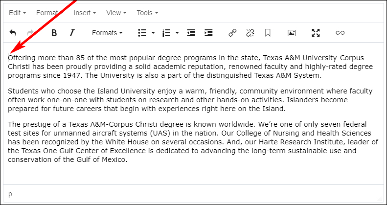
Step 2: Place the cursor right before the first word of the first paragraph of content.
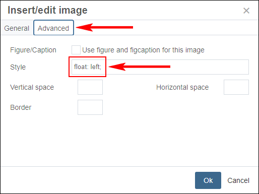
Step 3: Insert the image into the WYSIWYG editor content. Click the Advanced tab to switch the Insert/edit image dialog to the Advanced screen.
On the Advanced screen, enter the style to position the image tot he left or to the right.
Enter float:left; to position the iamge to the left.
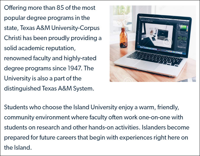
Enter float:right; to position the image to the right.
IMPORTANT: Make sure to include the semi-colon at the end of the
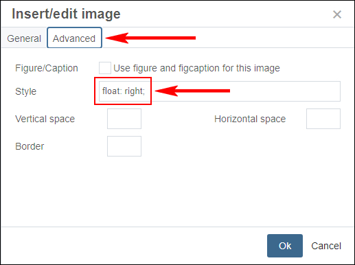
Step 4: Click the OK button to insert the image.
The image will be positioned at the top lef tor top right of the WYSIWYG editor and the text will wrap around the image.
Below are examples of images used in WYSIWYG editor content. In these examples, the images are set to float left or right.
Examples of images in WYSIWYG editor content:
Image aligned left
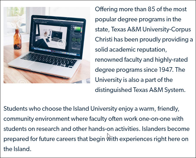
Image aligned right
This section provides content reference information for the Image - Single option for the Media component.
What this component does:
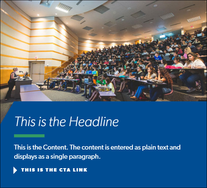
The Image - Single option creates a content block that includes an image, text content in the form of a title and description, and an optional Call-to-Action (CTA) link.
Component content entry fields:
Type field
The Type field selection for this option is Image - Single.

Text fields

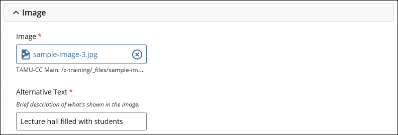
Image fields
Image dimensions: 1000 pixels wide by 600 pixels high (1000 x 600)
Call-to-Action (CTA) Link fields
The Call-to-Action link supports four types of links. Each link types has a specific set of fields.
Internal Page link
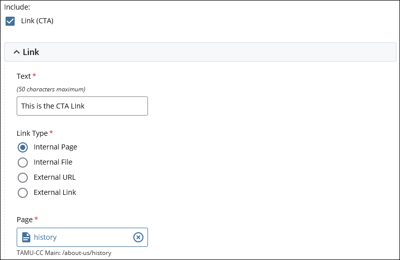
Internal File link
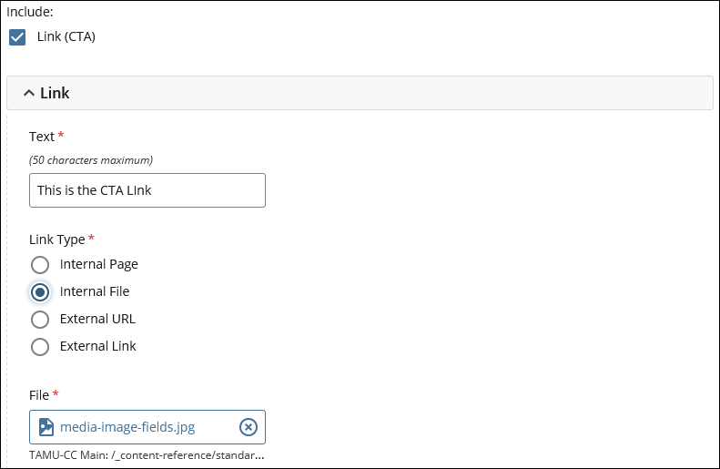
External URL link
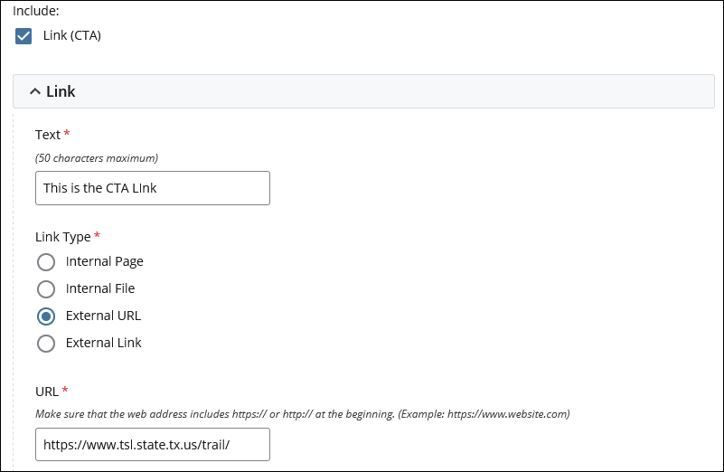
External Link link
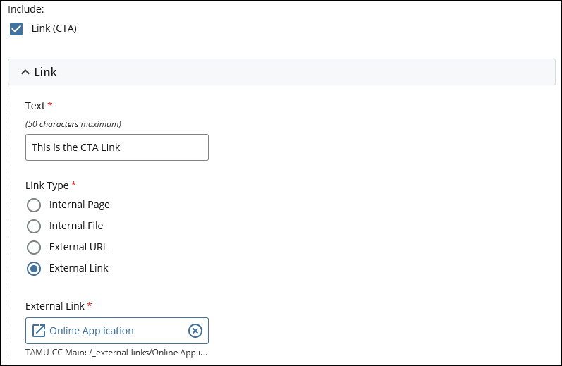
Example of how this component displays on the page:
Below is an example of how the Image - Single option of the Media component displays on the page.
This section provides content reference information for the Image - Slideshow option for Media component.
What this component does:
The Image - Slideshow option creates a content block that includes a slideshow including two to five images, text content in the form of a title and description, and an optional Call-to-Action (CTA) link.
Component content entry fields:
Type field
The Type field selection for this option is Image - Slideshow.

Text fields

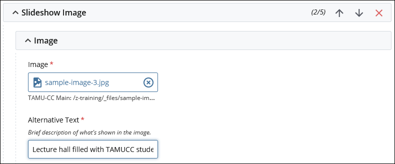
Image fields
Image dimensions: 1000 pixels wide by 600 pixels high (1000 x 600)
Call-to-Action (CTA) Link fields
The Call-to-Action link supports four types of links. Each link types has a specific set of fields.
Internal Page link

Internal File link

External URL link

External Link link

Component content entry notes:
The slideshow must have a minimum of two images.
The slideshow can have a maximum of five images.
The content of the Title and Description fields displays for each image in the slideshow.
The slideshow includes only a single Call-to-Action link, displayed below the Title and Description content.
Changing the order of the images in the slideshow
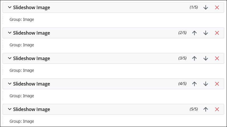
The top-to-bottom ordering of the Slideshow Image fields determines the ordering of the slides in the slideshow. The top image is displayed first in the slideshow, and is the image that's visible until the website user begins to move through the slideshow). The bottom image is the last image in the slideshow.
Use the Up and Down arrows to change the ordering of the images in the slideshow. Note that changing the order of the images is considered to be a change to the content of the page, so the page will need to be published for the changes to be reflected on the page on the TAMUCC website.
Example of how this component displays on the page:
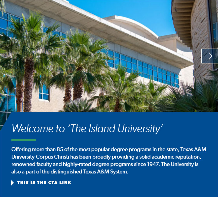
Below is an example of how the Image - Slideshow option of the Media component displays on the page.
Initial display of the slideshow
When the slideshow initially displays, there is only one navigational link displayed on the right side of the component.
Display in the middle of the slideshow
When moving through the slideshow, there are navigational links on the left and right sides of the component.

Display at the end of the slideshow
When the website user reaches the last slide of the slideshow, a navigational link is displayed only on the left side of the component.
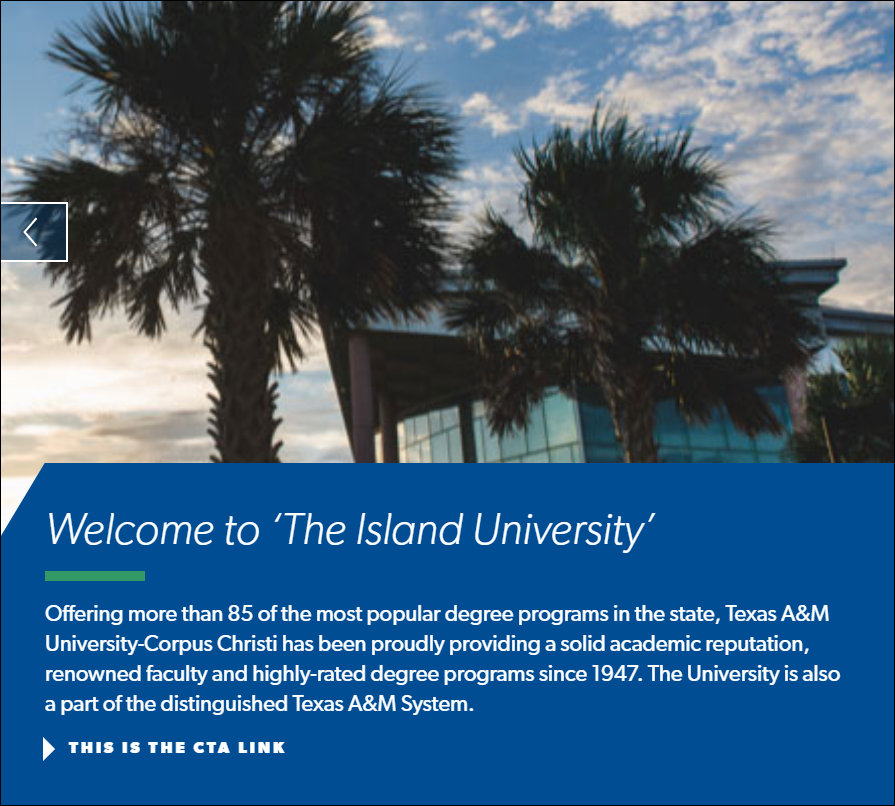
This section provides content reference information for the Video option for the Media component.
What this component does:
The Video option creates a content block that includes an image, a video, text content in the form of a title and description, and an optional Call-to-Action (CTA) link.
Component content entry fields:
Type field
The Type field selection for this option is Video.

Text fields

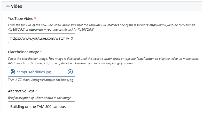
Video fields
Image dimensions: 1000 pixels wide by 600 pixels high (1000 x 600)
The image in the Placeholder Image field is displayed until the website visitor plays the video. In most cases, the image is a still of the first frame of the video. However, you may use any image you wish.
Call-to-Action (CTA) Link fields
The Call-to-Action link supports four types of links. Each link types has a specific set of fields.
Internal Page link

Internal File link

External URL link

External Link link

Component content entry notes:
YouTube video source
The full URL of the video's page on the YouTube website must be used.
Enter the full URL of the YouTube video into the YouTube Video field. Make sure that the YouTube URL matches one of these formats: https://www.youtube.com/embed/Xa8fIVCjFsY or https://www.youtube.com/watch?v=Xa8fIVCjFsY
Alternate video sources
The Video component is configured to use videos from YouTube as the primary source of the video. However, the component supports video URLs from the following sources:
- Vimeo
- Microsoft Stream
- Animoto
Each source has some specific requirements for formatting the URL of the video.
Vimeo
The video source URL needs to be in this format:
https://player.vimeo.com/video/334999453
The ID of the video is at the end of the URL.
Microsoft Stream
The video source URL needs to have the following special characters encoded. This means that the following characters need to be changed as follows:
& to &/ to %2F
: to %3A
space to %2520
Below is an example URL. Each character that was changed is shown in bold.
https://ampdemo.azureedge.net/azuremediaplayer_embed.html?url=%2F%2Fmsstream.streaming.mediaservices.windows.net%2F65e1553f-4005-4705-8c9d-283f73f18a1d%2FStream%2520Marketing%2520Video.ism%2Fmanifest&poster=https%3A%2F%2Fgxcuf89792.i.lithium.com%2Ft5%2Fimage%2Fserverpage%2Fimage-id%2F63146iD1E7A0AB88C0E822&autoplay=false&captions=English,en,%2F%2Fmsstream.streaming.mediaservices.windows.net%2F65e1553f-4005-4705-8c9d-283f73f18a1d%2FStream%2520Marketing%2520Video.vtt&theme=stream&wm=0
IMPORTANT: The video must be available publicly to be used. If the video requires a username/password to access, it will most likely not be able to be played on the website, since the page won't be able to fetch the video as the page will not have the username/password.
Animoto
The video source URL needs to have the & character encoded. This means that each & character in the video URL needs to be changed to: &.
Below is an example URL. Each & character that has been changed to & is shown in bold.
https://s3.amazonaws.com/embed.animoto.com/play.html?w=swf/production/vp1&e=1608148515&f=dTBtwbw65PerfuGhftRbEw&d=0&m=p&r=360p+480p+720p&volume=100&start_res=720p&i=m&ct=Learn%20more!&cu=tamucc.edu&asset_domain=s3-p.animoto.com&animoto_domain=animoto.com&options=loop
Example of how this component displays on the page:
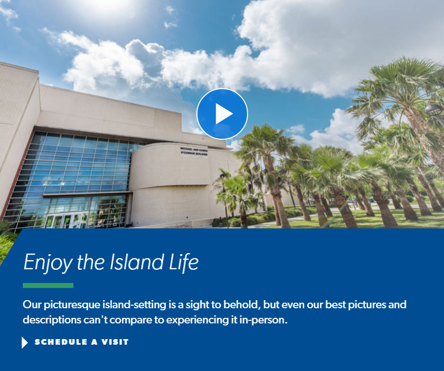
Below is an example of how the Video option of the Media component displays on the page. The display is the same regardless of the video source that is used.
Initial display of the component
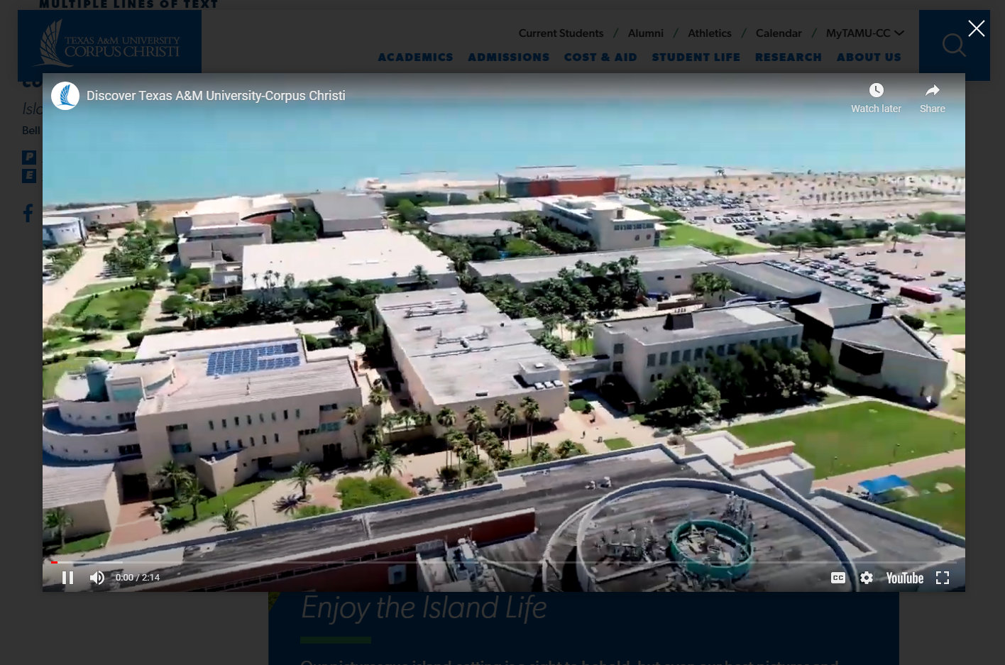
Display when the video is playing
The video is played in a panel that overlays the page. The page is "grayed out" so that the video stands out. After playing the video, the website user clicks/taps/tabs to the "X" at the top right of the panel to close it. The "gray out" is removed when the panel is closed.
This section provides content reference information for the Accordions component.
What this component does:
The Accordions component creates a set of expandable/collapsible "accordion" content blocks.
Component content entry fields:
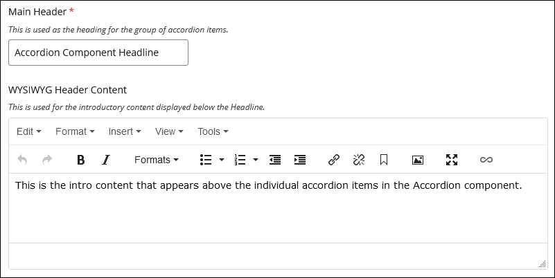
Accordions Intro fields
The Intro fields hold the main heading for the set of expandable/collapsible accordion items.
Accordion Item fields
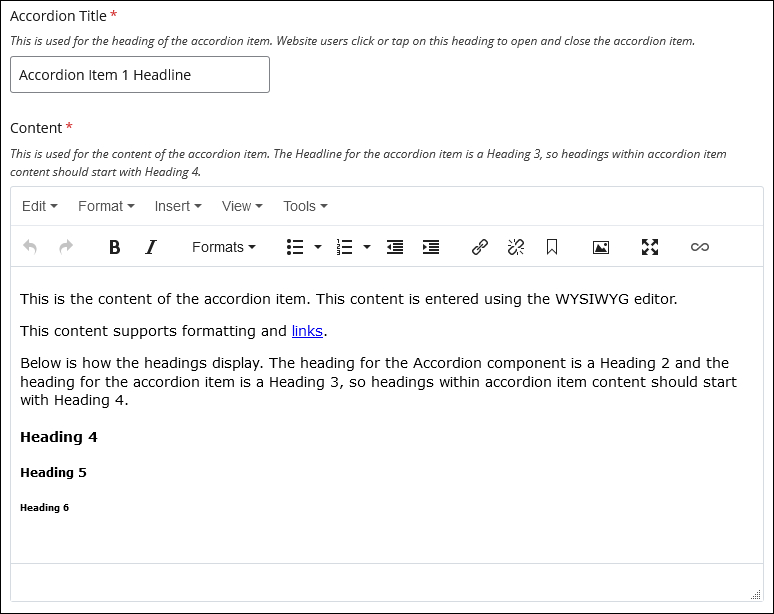
Component content entry notes:
The heading for the Accordion component is a Heading 2 and the heading for the accordion item is a Heading 3, so headings within accordion item content should start with Heading 4.
There is no limit to the number of accordion items that can be added.
The Accordion component must include a minimum of two accordion items.
Example of how the component displays on the page:
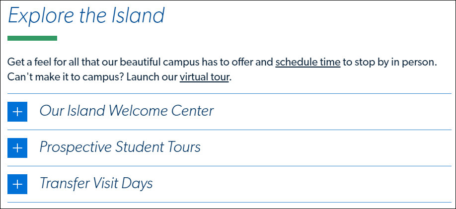
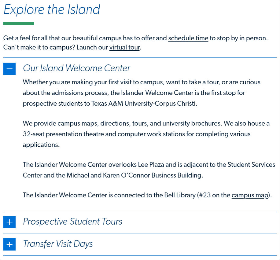
Below is an example of how the Accordions component displays on the page.
Initial display with all Accordion items closed
Display showing an open Accordion item
This section provides content entry reference information for the Related Articles component.
What this component does:
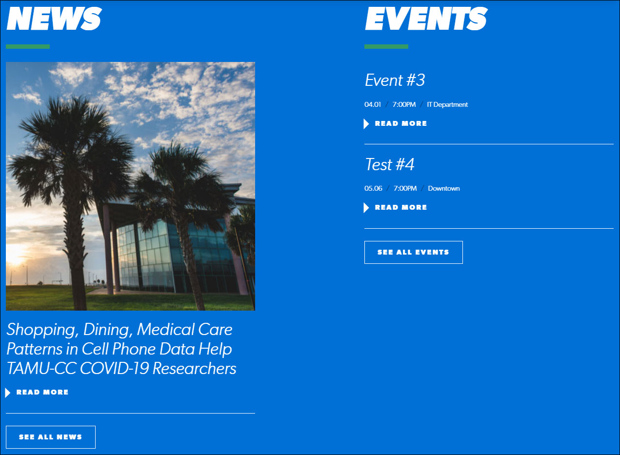
The Related Articles component pulls the content of two article pages into the page. Which article pages are pulled in is determined by the College selected. Only article pages assigned to the selected College are pulled in. This component is bundled with the Events component. When articles are pulled in, events are also pulled in.
The two most recent article pages (based on the Article Date field) that match the selected College are pulled in.
IMPORTANT: The No College Designated selection functions in the same manner as the selection of a college, such as Science & Engineering. When the No College Designated option is selected, only article pages assigned to No College Designated are pulled in.
The events are pulled in from the University's LiveWhale events calender. Currently, there is no method in the CMS to filter the events to pull in events assigned to a specific category or tag in LiveWhale. AS a result, the two chronologically-closest active events are pulled in.
Component content entry fields:
1. A Related Articles check box. This check box controls the visibility of the Related Articles and the Events on the page. When checked, the Related Articles and the Events are visible on the page. When unchecked, the Related Articles and Events are not visible on the page.
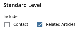
2. The Dynamic Feed field for selecting the College by which to filter the articles that are pulled in. Only articles assigned to the selected College are pulled in.

Component display on the page:
The articles are displayed on the page in reverse chronological (most recent first) based on the Article Date field.
The articles that are pulled in will update when new articles are added to the site, removed from the site, or assigned to the College category selected in the Dynamic Feed field.
The page does not need to be republished to pick up updates made to the news articles (content updates, College assignment, etc.). The articles display will update after the changes to the news article pages are published.
Example of how this component displays on the page:
Below is an example of how the Related Articles component displays on the page.
Sidebar Components
This section provides content entry reference information for the Contact component.
What this component does:
The Contact component displays up to two blocks of contact information in the left sidebar of the page, below the navigation links.
The contact information can be entered manually directly into the page or it can be pulled into the page by selecting Contact blocks.
The display of the information is the same whether the information is manually entered or pulled into the page through a Contact block.
Component content entry fields:
A Contact check box. This check box controls the visibility of the Contact information blocks on the page. When checked, the Contact information blocks are visible on the page. When unchecked, the Contact information blocks are not visible on the page.
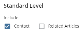
IMPORTANT: When the contact component is included on a page, the fields for this content display at the bottom of the page editing screen, so they can be easy to miss.
Contacts field for entering the contact information manually
Contact Option
This field is set to the Manual option when the contact information is entered directly into the page. Up to two sets of contact information can be entered into the page.

Title field
This field holds the title that is displayed above the contact information.

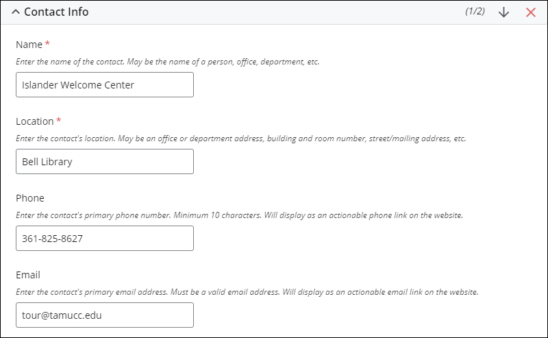
Contact Info fields
These fields hold the contact information.
The content entered into the Phone field is displayed as an actionable phone link. This would be used primarily on mobile devices to enable users to tap the lnk to call the phone number.
The content entered into the Email field is displayed as an actionable email link.
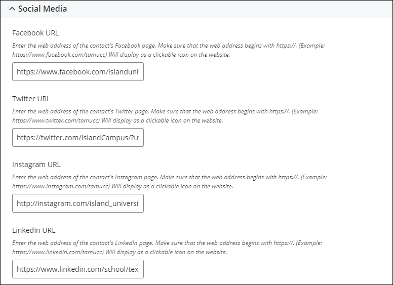
Social Media fields
These fields hold the web addresses (URLs) for several social media channels. The links are displayed as clickable icons on the website.
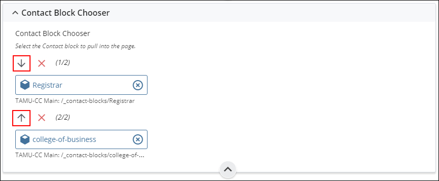
Contact Block Chooser field for selecting the Contact blocks to pull into the page
Contact Option
This field is set to the Choose Block option when the contact information pulled into the page using a Contact block.

Contact Block Chooser
This field is used to select the Contact block to pull into the page. Up to two Contact blocks can be selected.

Changing the order of the Contact information blocks:
Use the Up and Down arrows to change the ordering of the Contact information blocks on the page. The top-to-bottom ordering of the blocks in page edit mode translates directly to the top-to-bottom ordering on the page.

Example of how this component displays on the page:
The Contact information is displayed in the left sidebar of the page, below the navigation links.