Department Landing Page
This page provides content reference information for the components on the Department Landing page.
What the Department Landing Page is used for:
The College/Department Landing Page is used as the main page for site sections on the TAMU-CC Main site for specific colleges and departments. It also can be used as the main (home) page for other sites (and can be used as the main page for sections within these sites, as well).
Asset factory used to create a Department Landing page:
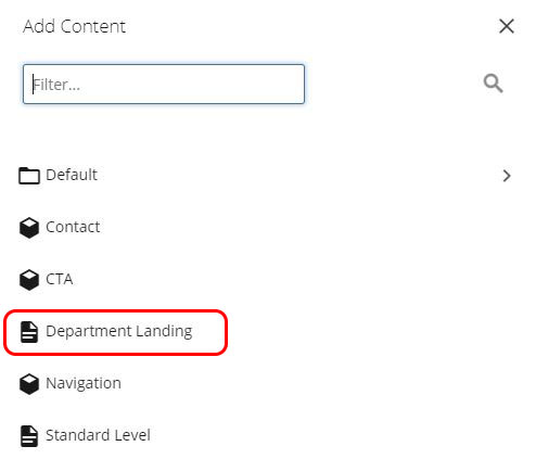
The Department Landing asset factory is used to create a new page using the Department Landing Page template.
Fixed Content Entry Fields

The Title field is used for:
- Title of the page in browser tab
- Title for the page in search results (on the TAMUCC site and external such as Bing and Google)
- Breadcrumb trail navigation
Metadata and Navigation Settings
The Description meta data field and the field for including the page in or excluding the page from the dynamic sidebar navigation are on the Metadata screen.
Click the Metadata tab at the top of the page editing screen to access the Metadata screen.

The Description meta data field and the field for including the page in or excluding the page from the dynamic sidebar navigation are on the Metadata screen.
Click the Metadata tab at the top of the page editing screen to access the Metadata screen.

The Show In Navigation field is used to to include the page in or to exclude the page from the dynamic navigation in the left sidebar.
When the Yes check box is checked, the page is included in the dynamic navigation in the left sidebar.
When the Yes check box is unchecked, the page is excluded from the dynamic navigation in the left sidebar.

Content Components
This section provides content reference information for the Masthead component.
What this component does:
The Masthead component holds the image, heading, and introductory content at the top of the page. A video can also be selected to play in this area.
Component content entry fields:
Type field
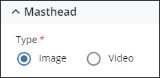
The Type field designates if the Masthead displays one to five images (Image option) or a video (Video option). The remaining fields hold the text content of the Masthead.
Text fields
The Headline Title Top and Headline Title Bottom fields create the main heading (H1) for the page
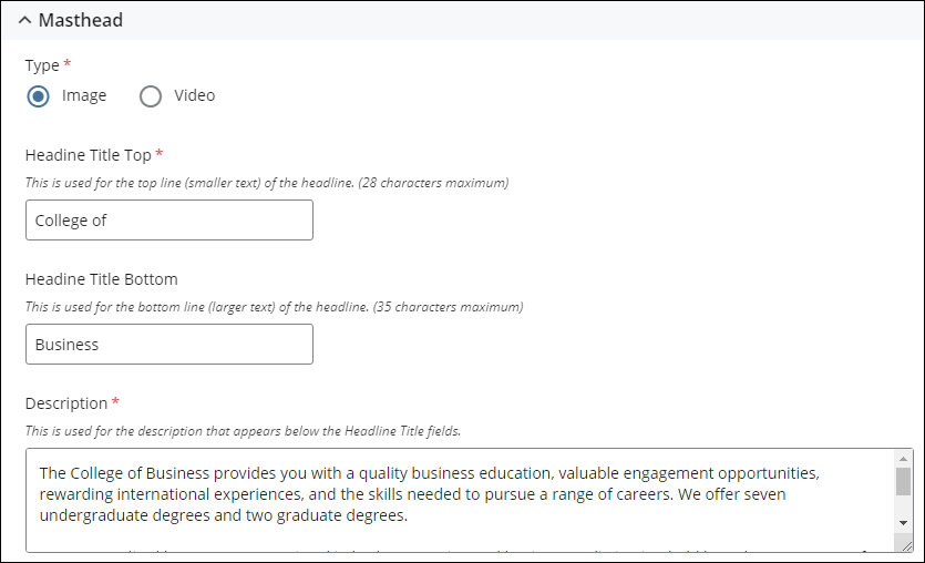
Image fields
Image dimensions: 1660 pixels wide by 788 pixels high (1660 x 676)

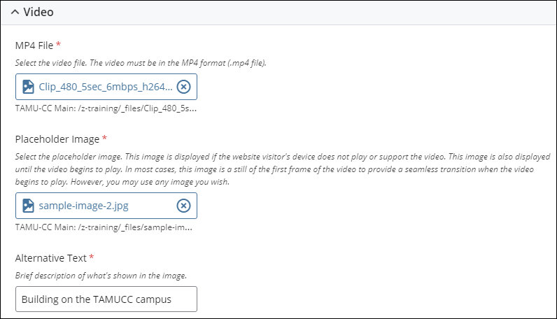
Video fields
Video: Standard 16:9 ratio.
Upload video file into the CMS in MP4 format (.mp4 file).
Maximum duration: 25 seconds
Maximum recommended file size: 10MB
Video should not have an audio track.
Placeholder Image dimensions: 2000 pixels wide by 900 pixels high (2000 x 900)
The image in the Placeholder Image field is displayed if the website visitor's device or browser does not play or support video. When the website visitor's device or browser supports video, the image is displayed until the video begins to play. In most cases, the image is a still of the first frame of the video to provide a seamless transition when the video begins to play. However, you may use any image you wish.
Example of how the component displays on the page:
Below is an example of how the Masthead component displays on the page.
Image display option

Video display option

This section provides content reference information for the Manual Cards component.
What this component does:
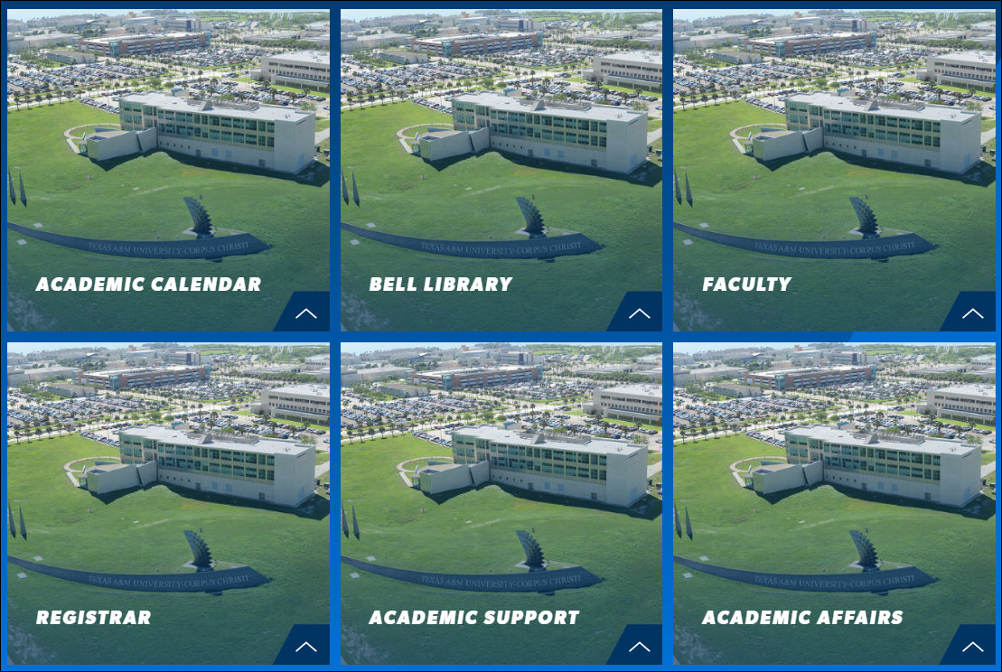
The Cards component creates grid of panels, or "cards", that link to specific pages on the website. The purpose of the Cards component is to provide links to the important pages within the section or site for which the College/Department Landing page is the main page.
The College/Department Landing page does not include navigation links, so the Cards component provides a way for website users to jump directly to the important pages within the section or site.
The content of each of the "card" panels in the grid is pulled from the sets of "Cards" fields in this component.
Cards are not limited to linking to pages within the section or site for which the College/Department Landing page is the main page. Cards can link to pages in other sections of the site, pages on other sites in the CMS, files uploaded into the CMS, and to external websites.
There is no limit on the number of Cards that can be added to the grid.
Component content entry fields:
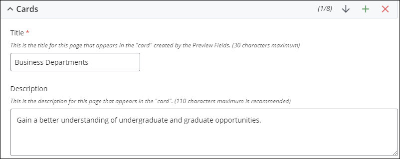
Text fields
These fields hold the text content of the card.
Link fields
The Link fields support the four types of links that can be created:
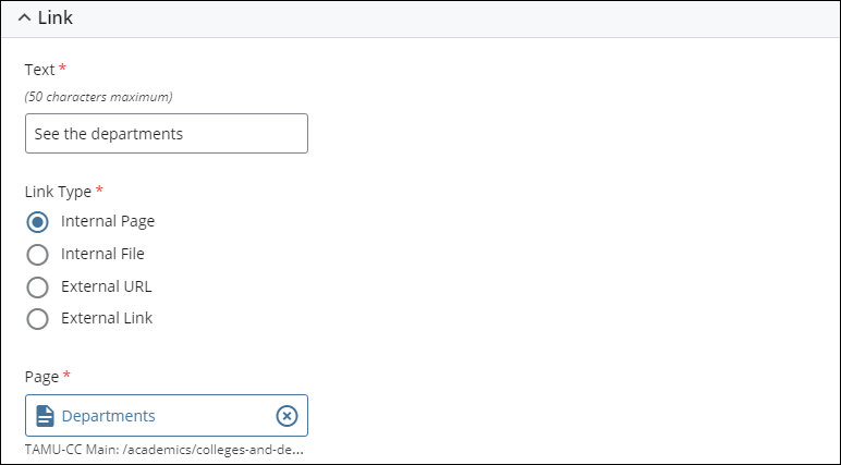
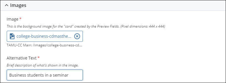
Image fields
Image dimensions: 600 pixels high by 600 pixels wide (600 x 600)
Example of how the component displays on the page:
Below is an example of how the Cards component displays on the page.
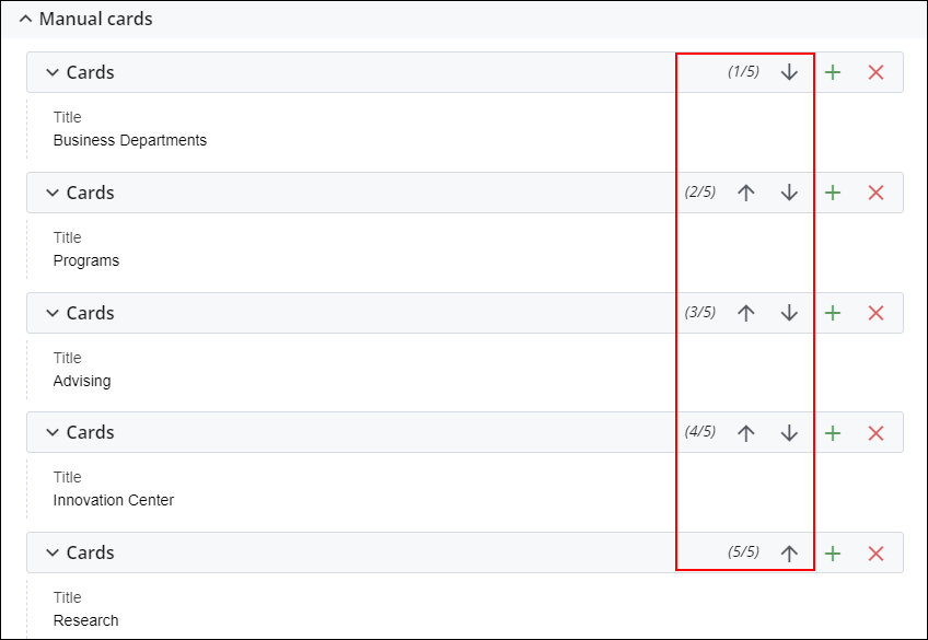
Changing the ordering of the Cards
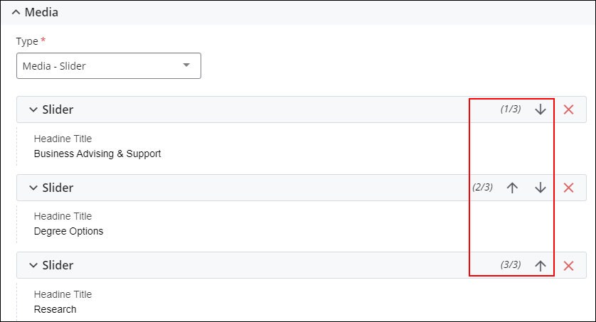
Use the Up and Down arrows to change the ordering of the Cards in the grid. The following section outlines how the Cards are arranged in the grid in different displays (standard browser, tablet, and mobile).
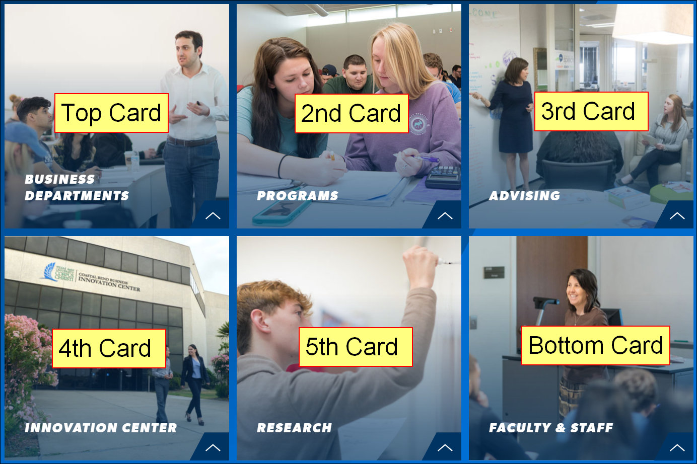
How the Cards are ordered in the grid
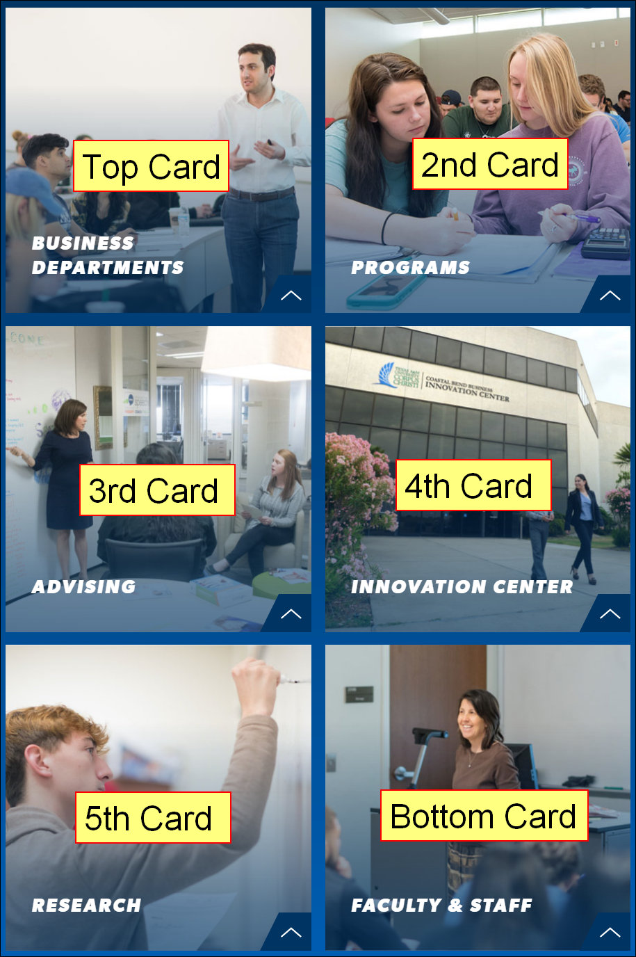
Below are examples of how the cards are arranged in standard browser view, tablet view, and mobile view.
Standard Browser View
In standard browser view, each row in the grid contains three cards. Going from top-to-bottom, the top three pages selected populate the first row. The next three pages make up the second row, and so forth.
The top card is always at top left of the grid and bottom card is always at the bottom right of the grid.
Tablet View
In tablet view, each row in the grid contains two cards. Going from top-to-bottom, the top two pages selected populate the first row. The next two pages make up the second row, and so forth.
The top card is always at top left of the grid and bottom card is always at the bottom right of the grid.
Mobile view
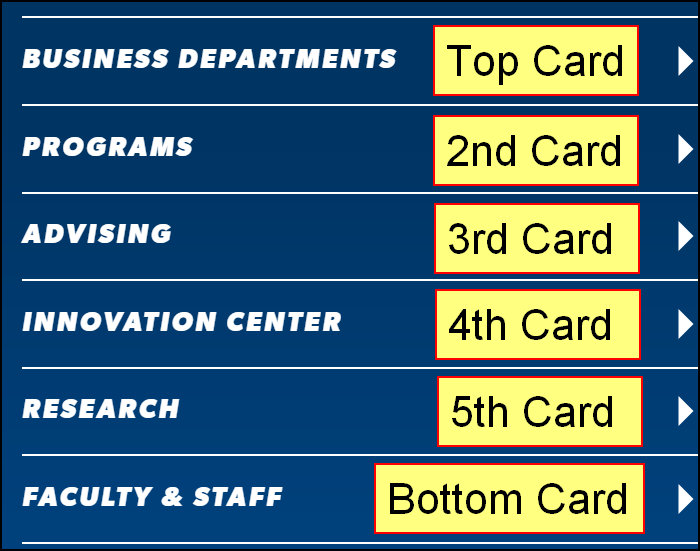
In mobile view, the cards are displayed in a single column. The top-to-bottom ordering of the pages selected translates directly to the ordering on the page.
IMPORTANT: Image and description are not displayed in mobile view
This section provides content reference information for the Media - Image component option.
What this component does:
The Media - Image component option displays a single image with descriptive text and a link.
Component content entry fields:
Type field
The Type field designates that the component uses the single image option.

Text fields
The Description field is used for the description displayed below the Headline Title fields. The more text content added to the component, the taller the component becomes to accommodate the content. This can cause the image to blur, especially if it is increased substantially from its original size.
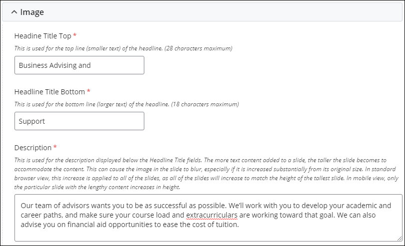
Image fields
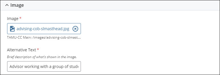
Image dimensions: 1513 pixels wide by 700 pixels high (1513x700)
Link fields
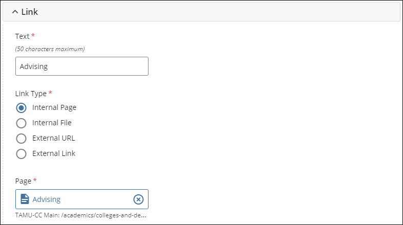
Example of how the component displays on the page:
Below is an example of how the Media - Image component option displays on the page.

This section provides content reference information for the Media - Slider component option.
What this component does:
The Media - Slider component option builds a carousel of up to three slides.
Component content entry fields:
Type field
The Type field designates that the component uses the slider option.

The carousel is made up of sets of Slider fields. Each set of Slider fields holds the content of one slide in the slideshow carousel.
Text fields
The Description field is used for the description displayed below the Headline Title fields. The more text content added to the component, the taller the component becomes to accommodate the content. This can cause the image to blur, especially if it is increased substantially from its original size. In standard browser view, this increase is applied to all of the slides, as all of the slides will increase to match the height of the tallest slide. In mobile view, only the particular slide with the lengthy content increases in height.
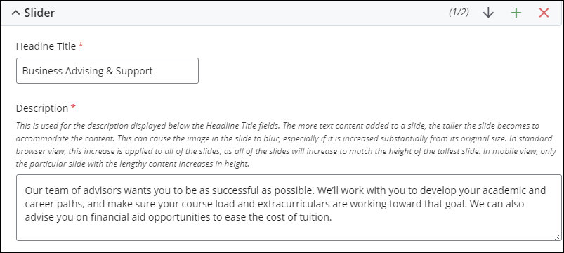
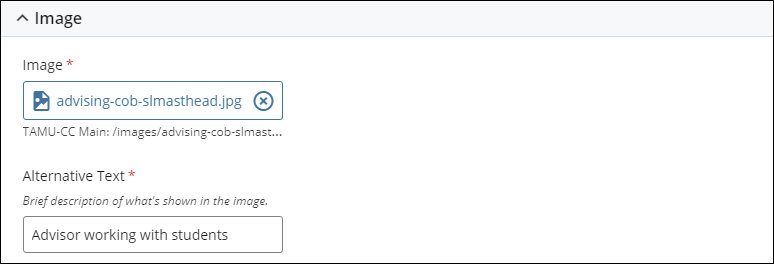
Image fields
Image dimensions: 1513 pixels wide by 700 pixels high (1513x700)
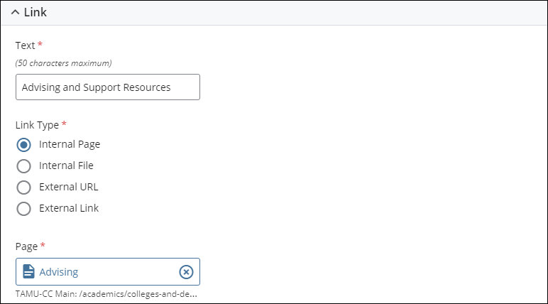
Link fields
How the slides in the slideshow carousel are ordered:
The top-to-bottom ordering of the Slider fields determines the ordering of the slides in the slideshow carousel. The top image is displayed first in the slideshow, and is the image that's visible until the website user begins to move through the slideshow carousel. The bottom image is the last image in the slideshow carousel.
How to change the order of the slides in the slideshow carousel:
Use the Up and Down arrows to change the ordering of the images in the slideshow carousel. Note that changing the order of the images is considered to be a change to the content of the page, so the page will need to be published for the changes to be reflected on the page on the website.
Example of how the component displays on the page:
Below is an example of how the Media - Slider component option displays on the page.

This section provides content reference information for the Media - Video component option.
What this component does:
The Media - Video component option displays a video. Descriptive text and an image overlays the video.
Component content entry fields:
Type field
The Type field designates that the component uses the video option.

Text fields
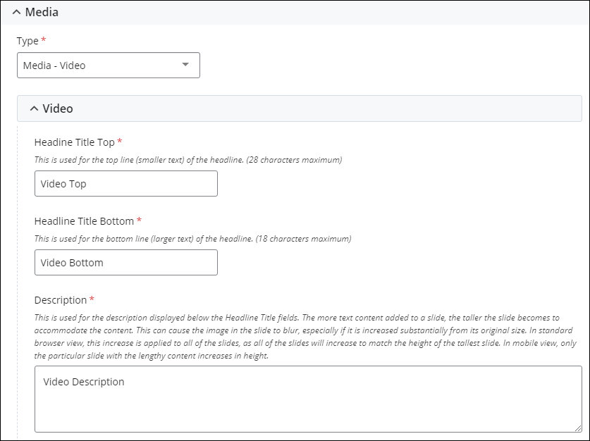
Video and Image fields
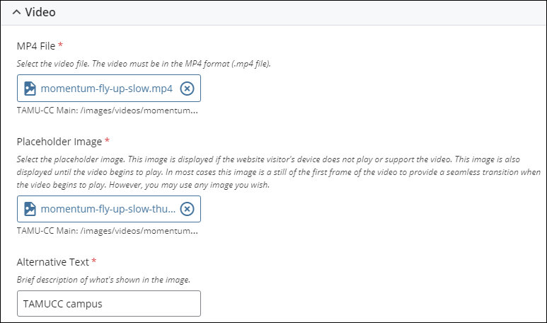
The video file is uploaded into the CMS. The video must be in the MP4 format (.mp4 file extension).
The image in the Placeholder Image field is displayed until the website visitor plays the video. In most cases, the image is a still of the first frame of the video. However, you may use any image you wish.
Image dimensions: 1513 pixels wide by 700 pixels high (1513x700)
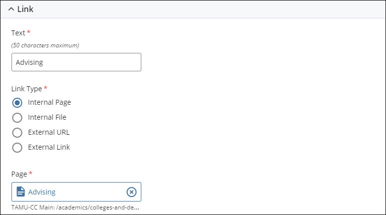
Link fields
Example of how the component displays on the page:
Below is an example of how the Media - Video component option displays on the page.

This section provides content reference information for the Additional Content component.
What this component does:
The Additional Content component provides text content and a grid of up to four link "buttons" next to the text content.
Text entry fields:
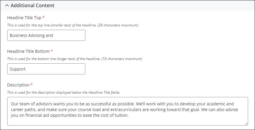
Link fields
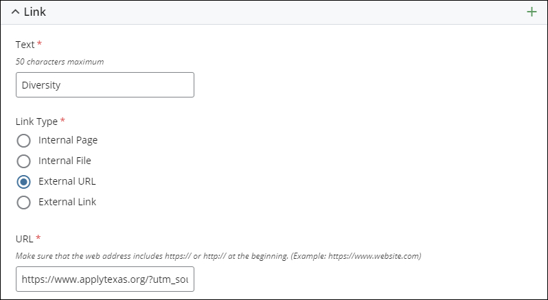
The Additional Content component supports up to four "button" links. Use the "+" icon to add links. Up to four links can be added.

Each link can point to a page, file, or External Link in the CMS or directly to an external website.
Changing the ordering of the Links
Use the Up and Down arrows to change the ordering of the Links in the grid. The following section outlines how the Cards are arranged in the grid in different displays (standard browser, tablet, and mobile).
How the Links are ordered in the grid
In standard browser, tablet, and mobile views, the links are displayed in square. The link at the top in page edit view is at the top left of the square and the link at the bottom in page edit view is at the bottom right of the square, with the other two links filling the slots in between.
|
Top |
Second |
|
Third |
Bottom |
Example of how the component displays on the page:
Below is an example of how the Additional Content component displays on the page.

This section provides content entry reference information for the Related Articles component.
What this component does:
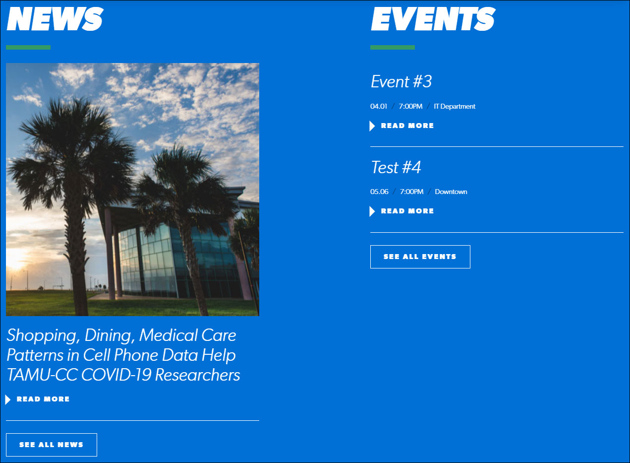
The Related Articles component pulls the content of two article pages into the page. Which article pages are pulled in is determined by the College selected. Only article pages assigned to the selected College are pulled in. This component is bundled with the Events component. When articles are pulled in, events are also pulled in.
The two most recent article pages (based on the Article Date field) that match the selected College are pulled in.
IMPORTANT: The No College Designated selection functions in the same manner as the selection of a college, such as Science & Engineering. When the No College Designated option is selected, only article pages assigned to No College Designated are pulled in.
The events are pulled in from the University's LiveWhale events calender. Currently, there is no method in the CMS to filter the events to pull in events assigned to a specific category or tag in LiveWhale. As a result, the two chronologically-closest active events are pulled in.
Component content entry fields:
The Dynamic Feed field for selecting the College by which to filter the articles that are pulled in. Only articles assigned to the selected College are pulled in.

Component display on the page:
The articles are displayed on the page in reverse chronological (most recent first) based on the Article Date field.
The articles that are pulled in will update when new articles are added to the site, removed from the site, or assigned to the College category selected in the Dynamic Feed field.
The page does not need to be republished to pick up updates made to the news articles (content updates, College assignment, etc.). The articles display will update after the changes to the news article pages are published.
Example of how this component displays on the page:
Below is an example of how the Related Articles component displays on the page.
